Negative Returns Are Normal
A lot of investors, especially newer ones, can come away with the impression that stock markets mostly go up. That is understandable. If your experience has been shaped mainly by the post-2009 period, and especially the years after 2010, you have seen a very strong run in equities, particularly in the US. Using Aswath Damodaran’s annual S&P 500 total return data, the market was positive in 13 of the 15 calendar years from 2011 to 2025, with negative years in 2018 and 2022 (Damodaran 2026).
That is a favourable sequence of returns, and it can distort expectations about what ‘normal’ looks like. Negative returns, however, are a normal part of equity investing. A positive expected return does not mean positive returns every year.
Bull Markets Can Make This Easy to Forget
Strong bull markets shape investor expectations. After a long run of positive returns, it becomes easy to treat losses as unusual, when they are not.
Vanguard’s UK bull and bear market chart is useful context here. It defines a bear market as a fall of more than 20% and a bull market as a rise of more than 20%, using FTSE All Share total return data (GBP, monthly). In the current UK chart (time period 31/12/1945 to 31/12/2023), Vanguard shows a total bull period of 66 years and 9 months versus a total bear period of 11 years and 4 months. The average bull period is 6 years and 1 month, whilst the average bear period is 1 year and 2 months (Vanguard 2025).
The broader long-run evidence points in the same direction. The UBS Global Investment Returns Yearbook public summary states that the DMS database provides annual returns on stocks, bonds, bills, inflation and currencies for 35 markets, and that the 2025 edition draws on 125 years of market history (Dimson, Marsh, and Staunton 2025).
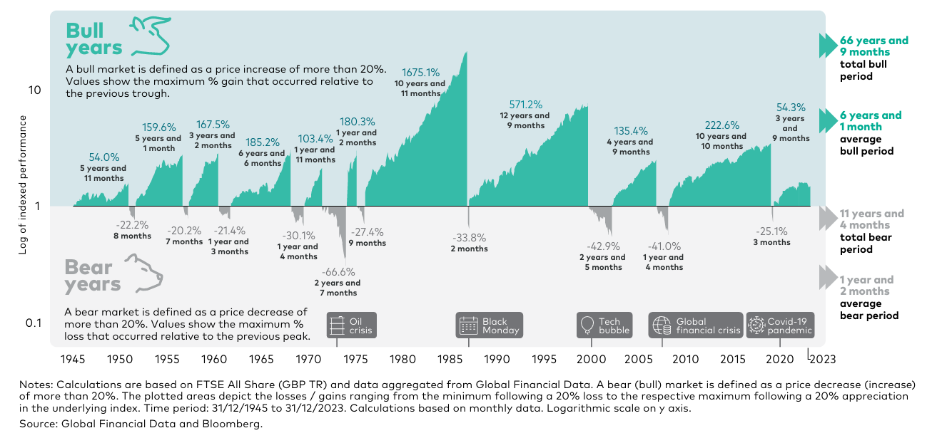
Figure 1. See Vanguard (2025)
The Point of the Below Chart
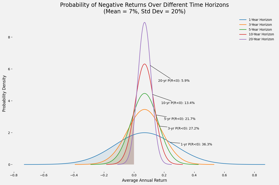
Figure 2. An illustrative example of the probability of negative returns.
The chart above shows how the probability of a negative return changes as the investment horizon gets longer under a simple illustrative setup:
Expected annual return μ = 7%
Annual volatility σ = 20%
Returns are assumed to be normally distributed
The chart shows the distribution of the average annual return over different horizons
The key step is that the volatility of the average annual return falls with the horizon n:
σₙ = σ / √n
So with σ = 0.20, the horizon-specific volatility is:
σ₁ = 0.20
σ₃ = 0.20 / √3 ≈ 0.1155
σ₅ = 0.20 / √5 ≈ 0.0894
σ₁₀ = 0.20 / √10 ≈ 0.0632
σ₂₀ = 0.20 / √20 ≈ 0.0447
To estimate the probability of a negative return, convert 0 to a z-score:
Z = (0 − μ) / σₙ
With μ = 0.07, the results are:
1 Year
Z = (−0.07) / 0.20 = −0.35 ⇒ P(R < 0) ≈ 36.3%
3 Years
σ₃ = 0.20 / √3 ≈ 0.1155
Z = (−0.07) / 0.1155 ≈ −0.61 ⇒ P(R < 0) ≈ 27.2%
Here, 0% return is about 0.61 standard deviations below the mean, so the area to the left of that point under the bell curve is about 27.2%. Test this yourself in Excel / Google Sheets: =NORM.S.DIST(-0.61,TRUE)
5 Years
σ₅ = 0.20 / √5 ≈ 0.0894
Z = (−0.07) / 0.0894 ≈ −0.78 ⇒ P(R < 0) ≈ 21.7%
10 Years
σ₁₀ = 0.20 / √10 ≈ 0.0632
Z = (−0.07) / 0.0632 ≈ −1.11 ⇒ P(R < 0) ≈ 13.4%
20 Years
σ₂₀ = 0.20 / √20 ≈ 0.0447
Z = (−0.07) / 0.0447 ≈ −1.57 ⇒ P(R < 0) ≈ 5.9%
These are the probabilities shown in the chart. The main point is simple: a negative one-year return is not unusual. Under this setup, it should happen more than one-third of the time.
As the horizon extends, the probability of a negative result falls. That is what you would expect when returns compound around a positive long-run average. But the probability does not fall to zero.
Why This Matters For Investors
If an investor expects equities to rise most of the time, a normal drawdown can feel like a reason to change asset allocation decisions.
However, it is more useful to assume that negative returns will happen, and may happen at inconvenient times. Portfolio design should reflect that reality. This is also why time horizon matters so much. If money is needed in one year, equity risk is very different from a ten- or twenty-year horizon. The same asset can be appropriate for one goal and inappropriate for another, simply because the timelines are different.
The chart is therefore an expectations tool. At one year, losses are common. At longer horizons, they become less common, but they remain possible.
A Note On Interpretation
The percentages in the chart are illustrative rather than a direct historical backtest. They come from a simplified return distribution assumption, so they are best treated as an illustrative tool rather than a precise forecast.
In real markets, outcomes depend on valuation starting points, inflation, country exposure, and the period analysed. Even so, the broad message is robust: equity returns are expected to be negative at times, especially over shorter time horizons, and investors should plan for that.
References
Damodaran, Aswath. 2026. ‘Historical Returns on Stocks, Bonds and Bills: 1928–2024’ (updated January 2026). NYU Stern School of Business.
Dimson, Elroy, Paul Marsh, and Mike Staunton. 2025. UBS Global Investment Returns Yearbook 2025, public summary edition. UBS and London Business School.
Vanguard. 2025. Bull and Bear Markets Over Time (UK version; FTSE All Share GBP TR, monthly data, 31/12/1945 to 31/12/2023). Vanguard calculations using Global Financial Data and Bloomberg.